
The result of our early exploration was a uniquely shaped label that could be easily applied in-house by the roasters—reducing both packaging costs and the overall environmental footprint of production.
During the concept phase we explored many options for the label looking at how to incorporate previous brand elements into different layouts, colour palettes and type.

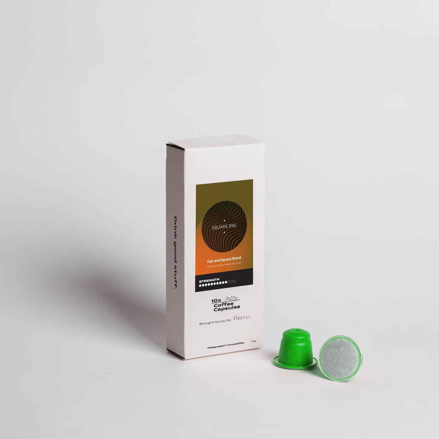
We also had the chance to apply the design to packaging for Coffee Capsules
as part of ‘Thieves Coffee’ subscription service.


SQUARE ONE COFFEE
Building on a classic.
Working on a Melbourne coffee brand is a dream brief for many, so when Square One approached us to refresh their packaging, we were all in.
Their previous design—created by Melbourne studio Pop & Pac—had become iconic, housed in a distinctive cylindrical canister and wrapped in the brand’s bold kaleidoscope pattern to differentiate each coffee variety.
But Square One was ready for a change. The custom canister, while visually striking, came with high production costs and sustainability drawbacks. The brief was clear: retain the brand’s recognisable energy while moving toward a more practical and environmentally conscious solution.
Our response was a suite of vibrant labels that hero the kaleidoscope motif, this time set against rich gradients inspired by both natural landscapes and the coffee-making process. The use of layered colour brought a fresh visual edge—offering contrast to the flat tones seen across much of the category.
SERVICES
Packaging
YEAR
2024