Gracey’s Pizza
Developing a consistent brand system for London’s favourite, Gracey’s Pizza.
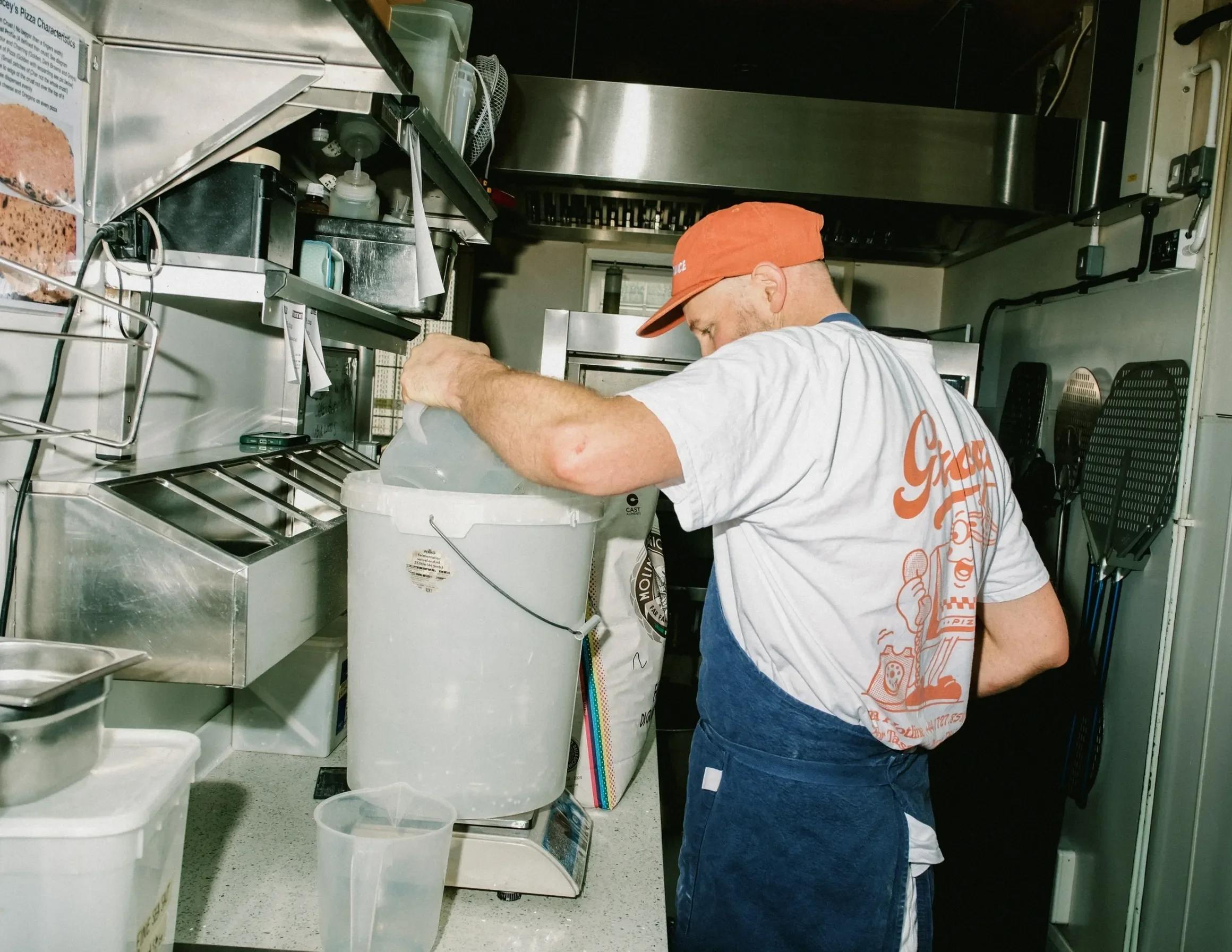
James and Gracey over the years had always been getting in touch to make a shirt for them or a design for their pizza boxes and the timing was unfortunately never right. When they got in touch at the start of the year, they explained how they needed a more cohesive brand as they were expanding throughout the UK. This time around the timing was perfect and we looked at how we could make the Gracey’s brand stronger, deeper and more consistent.
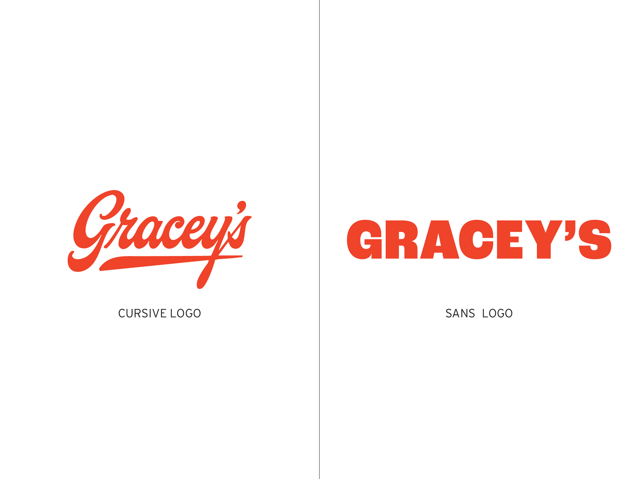
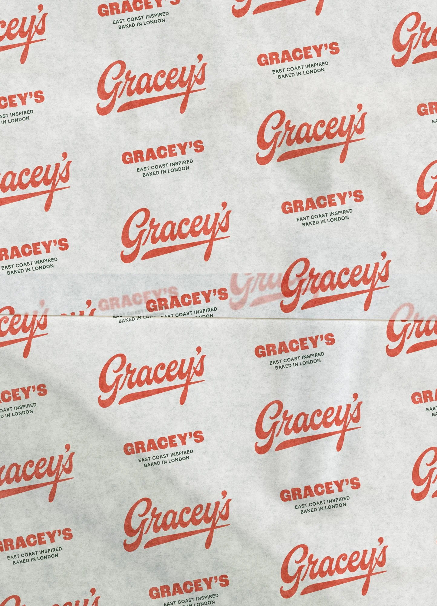
The established brand already had some strong elements that we wanted to keep, mainly the cursive logo and some other things we thought could be built on.
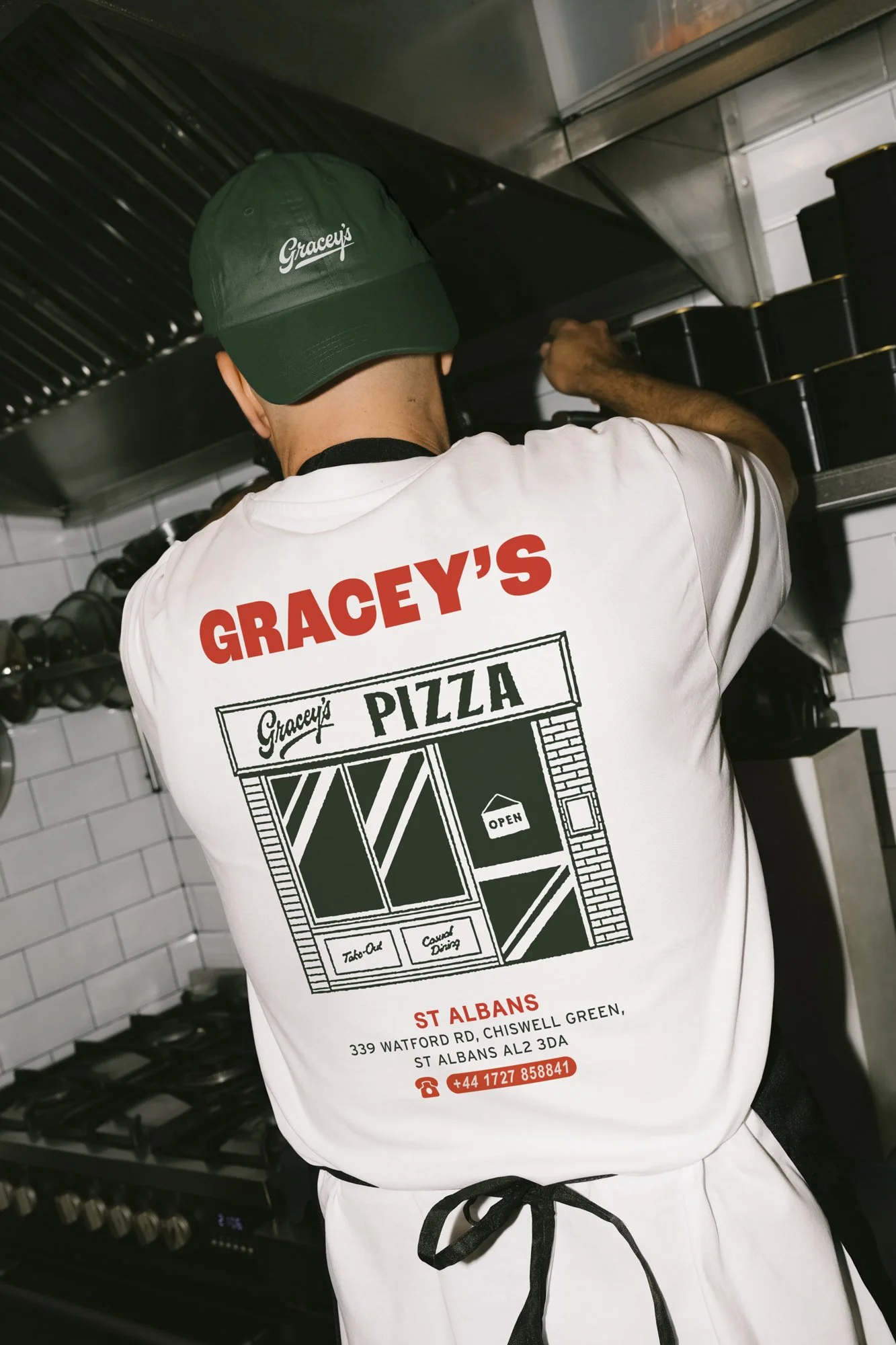
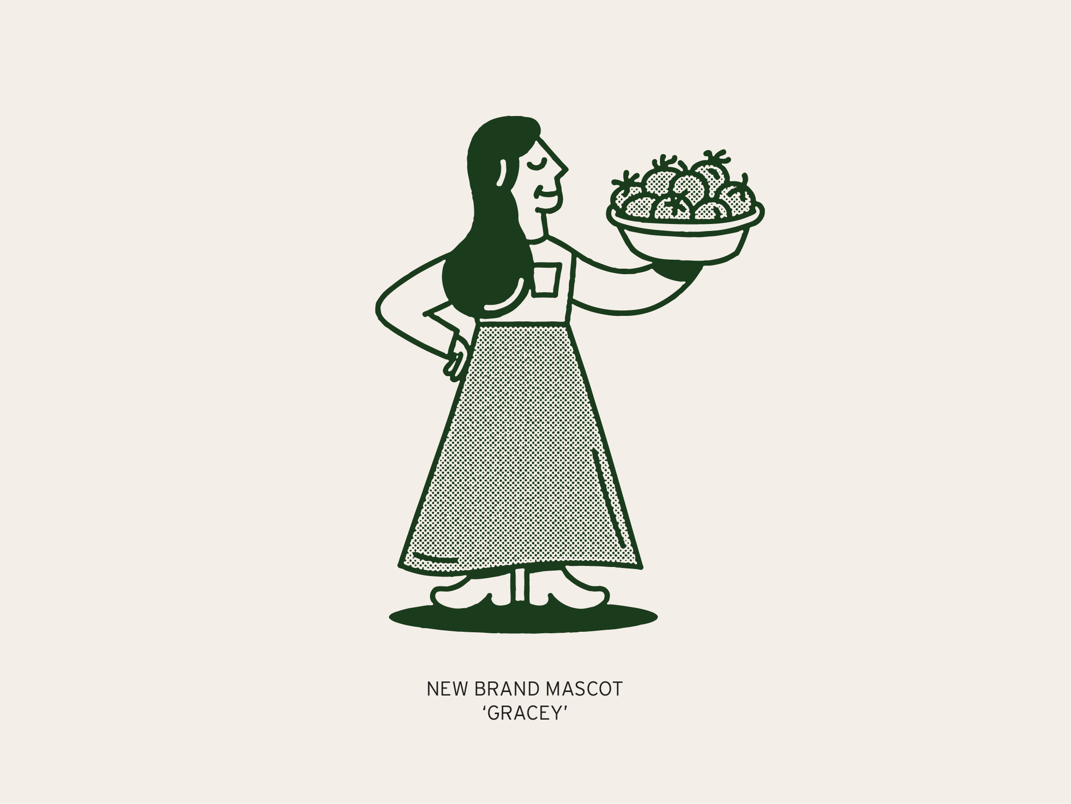
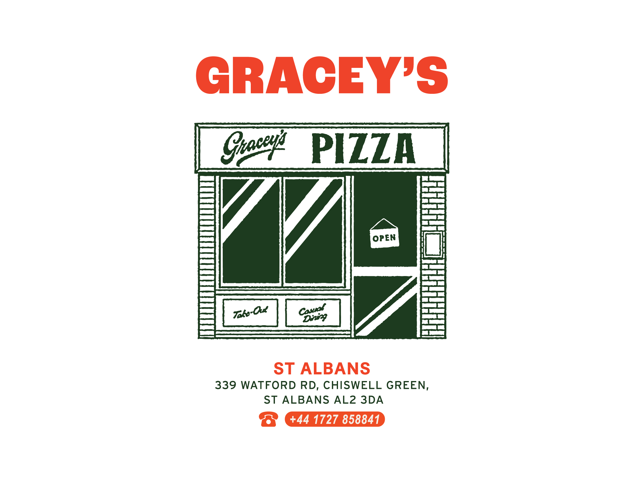
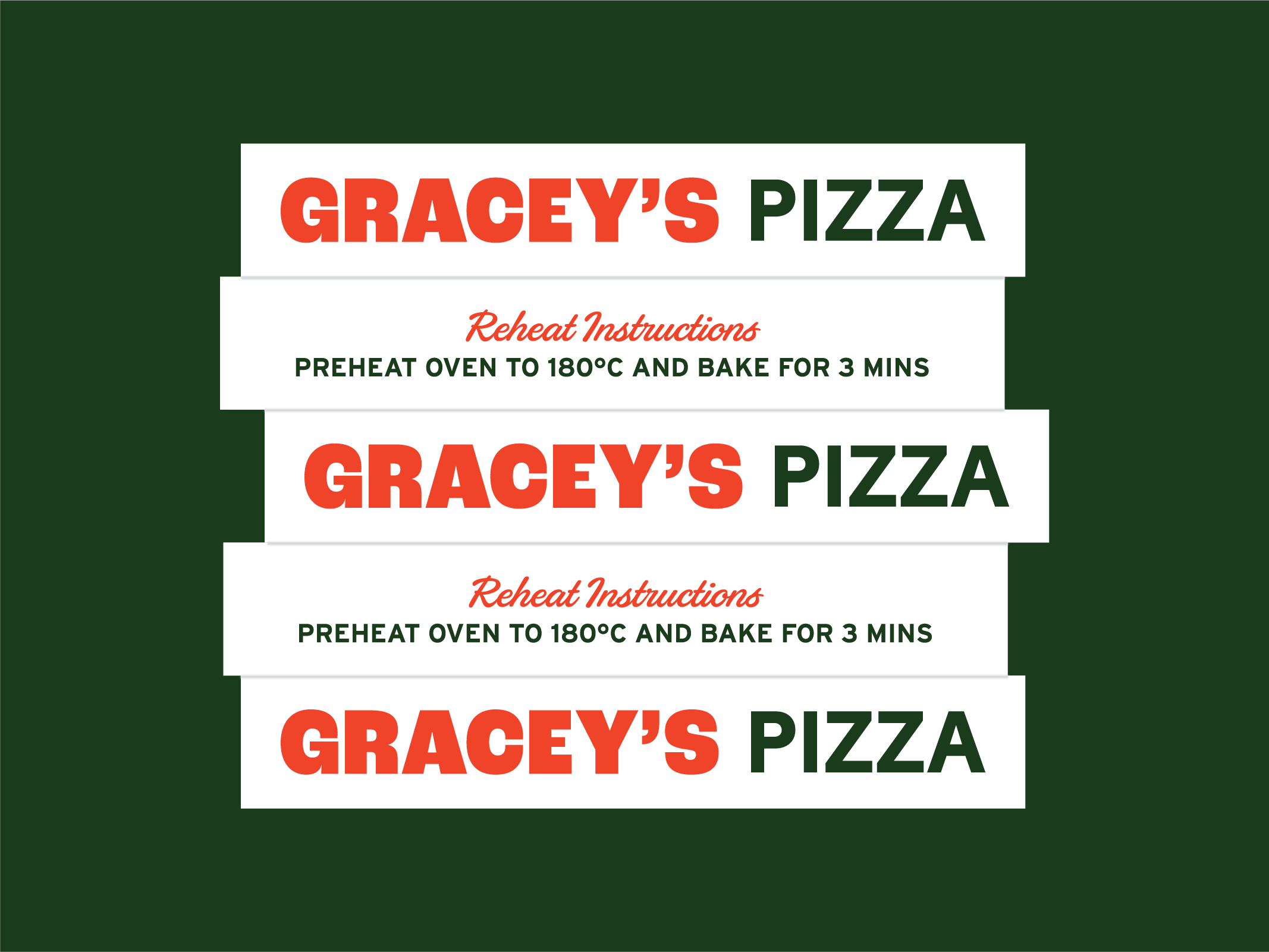
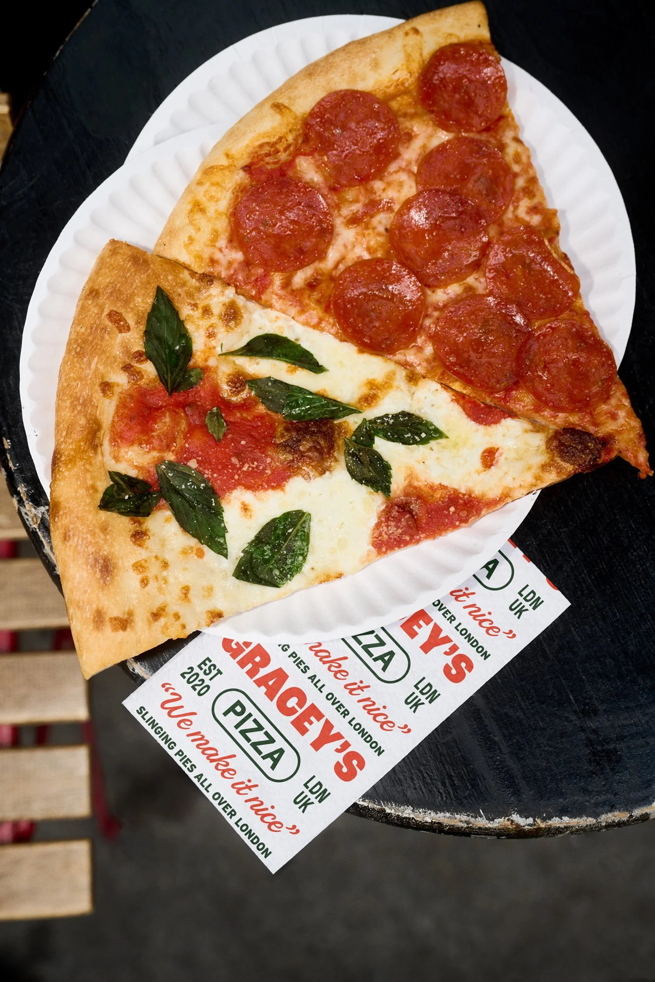
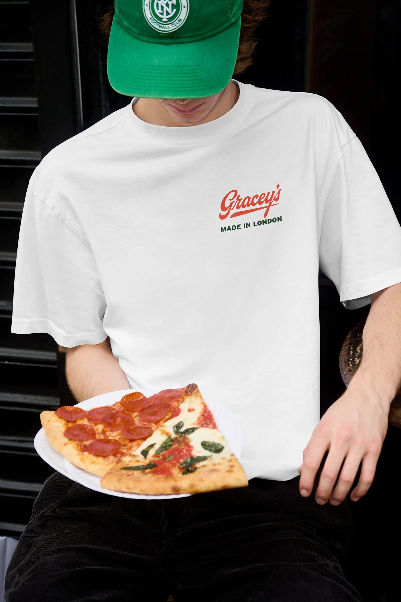
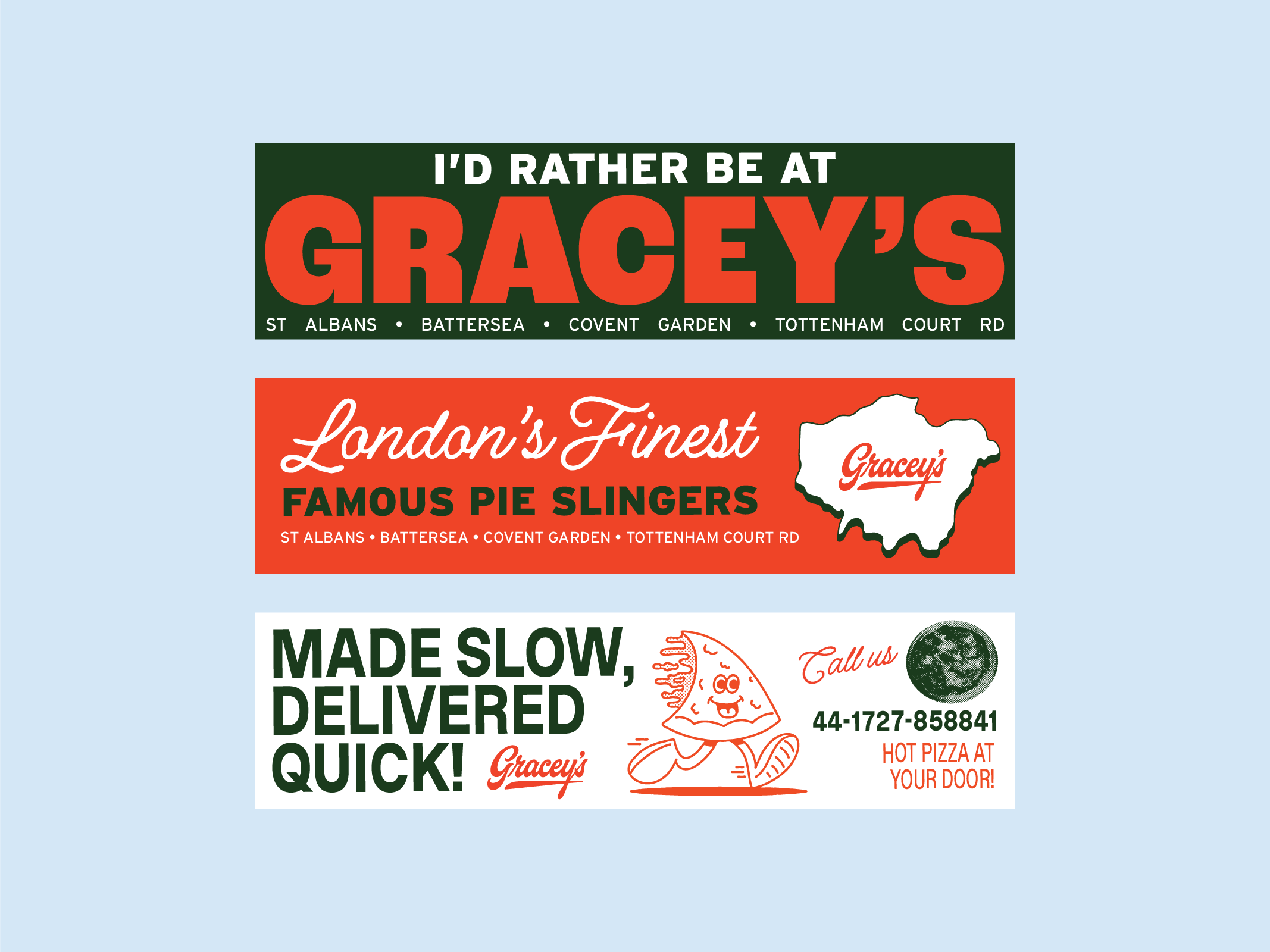
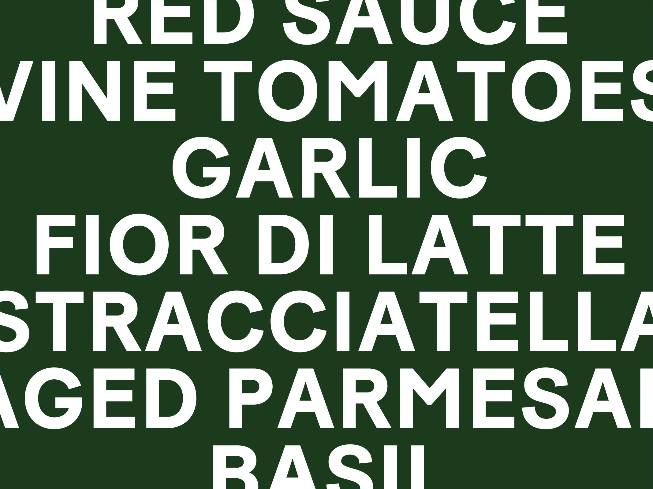
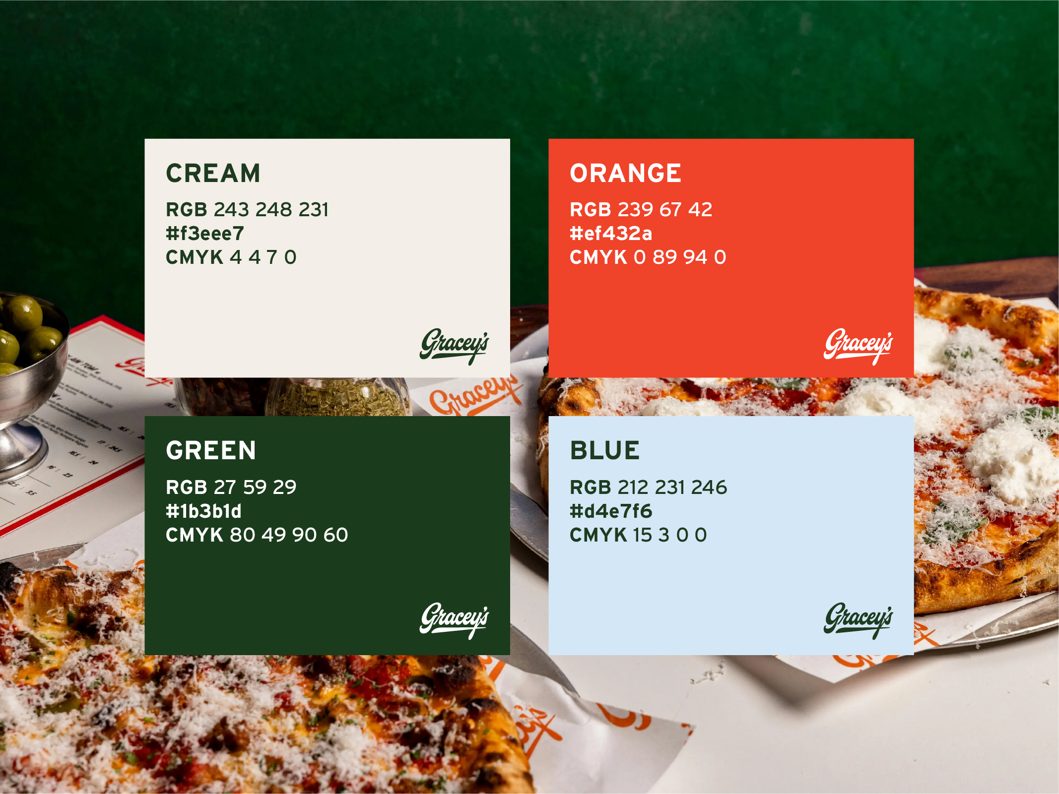
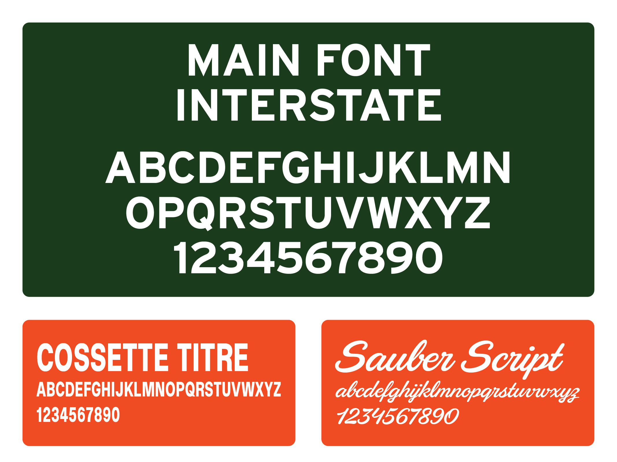
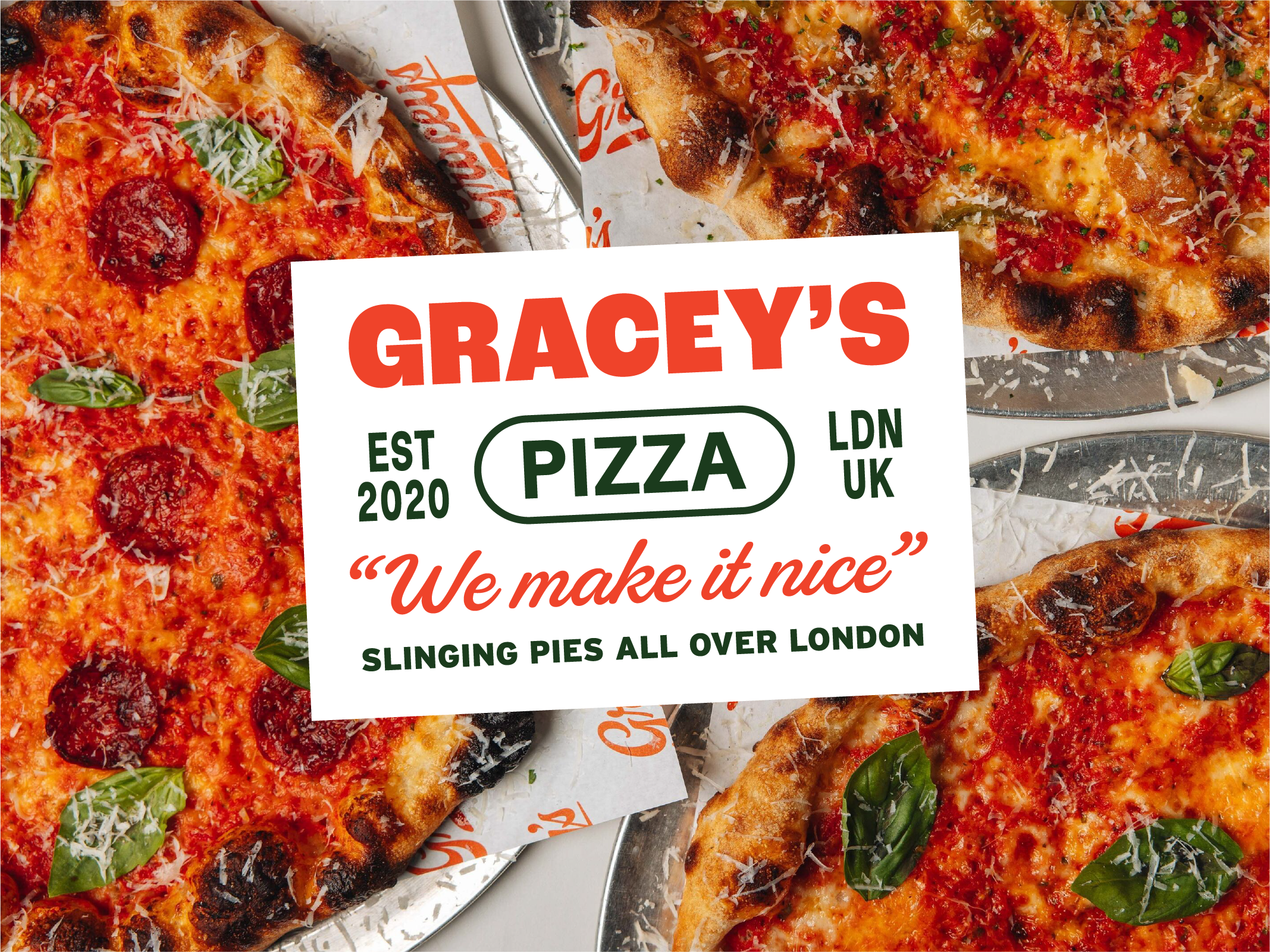
We introduced a Sans logo for Gracey’s which is bold and can be used across applications that have more/specific real estate where the cursive logo didn’t work so well. We also built on their previous colour palette, introduced a typography system as well as a library of illustrations for merch and digital use.
SERVICES
Brand System
Illustration
Packaging
Uniform
Social Media suite